Absalon Visual Identity
Absalon is community center in Copenhagen. What was once an old church has transformed into a center for people to connect, get coffee, attend fun events and have dinner with others in the community. A new visual identity (logo, business cards, work shirts, event poster, bag merchandise) was developed using its core 5 colors from the institution's interior walls to develop the whimsical nature of the institution.

THE PROCESS (3-PHASES):
PHASE 1: DISCOVER
Phase 1 included extensive research on the organization, visiting the private institution on-site (taking pictures and talking to the manager and locals about what Absalon means to them). In addition, I visited its competitor on-site and talked with the manager to understand the differences between public and private institutions.


PHASE 2: DEFINE
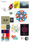
Phase 2 included developing 5 mood board concepts using general design images based on all the information collected from Absalon; In this case the mood boards were connection, colorful, whimsical, DIY (do-it-yourself), and homey. These mood boards then led to the beginning of initial logo sketches.


PHASE 3: DEVELOP
Phase 3 included furthering the developed logos into Adobe designs for critiques. After critiques, a logo concept was chosen to be furthered for the visual identity.
.jpg)
.jpg)
.jpg)
.jpg)
.jpg)
FINAL PIECES:


